

The Ancient Mariner would be strangely at home, or rather adrift in our current world of data overfill.
Humans have the potential to allow their foolishness to let them drown in data. It is a little like when confronted with what appears to be sensible logic (at least on the surface) for instance with quantifiable data, humans have an innate desire to meet this with irrational logic.
The mistake lies in reification. It does not matter what the object of that reification is. Once the special status has been bestowed on it, all logic goes out the window. This is particularly unfortunate when logic itself (in the form of data) becomes the object of homage.
All at Sea
January saw the first negative return on the S&P 500 since August 2019. Having got off to a strong start, it seemed to catch a mid-month coronavirus and wheezed and coughed its way to lose all it had gained and splutter out the month just below flat.
But what was happening—not at a narrative level, but at a data level—that was fueling the “Once Upon a Time in China there was a flu…” story?
Nonsensical?
To be clear, there is nothing wrong with being concerned about the emergence of a previously undetected disease, both at the individual (micro) or global (macro) level or its potential economic impact. The issue is, when met with certain amounts of data concerning something like this how is this data being assembled, processed and then digested at all of these levels.
Fear and Loss
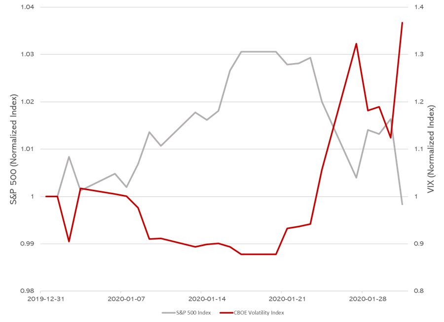
This chart when casually eyeballed leaves the viewer in no doubt of the inversely proportionate relationship between Fear (Increasing VIX) and Loss (Decreasing S&P 500).
The relationship, however, is not nearly as visually striking when viewed with a shared normalized axis.
More Fear, Less Loss
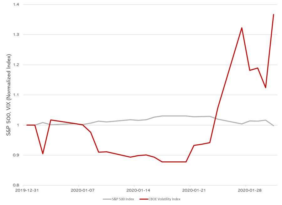
These charts serve to illustrate the visceral impact that data can have. In a sense it depends on which chart you choose, which is interesting considering that the underlying data is unchanged.
Viral Immunity
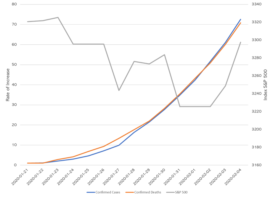
Two trading days into February the S&P was up +2.23%, in the meantime the said same coronavirus that “caused’ the mid-January fall of -3.03% was spreading at a more alarming rate than when its market impact kicked in on 23rd January. The 2019-nCoV has maintained a remarkably consistent death to infection rate which as can be seen from the following chart based on World Health Organization figures for confirmed infections and confirmed deaths. In contrast, look at the behavior of the S&P 500 over the same period.
What is crucial to remember here, is the importance of remaining focused on the contextual basis for analyzing any data. It is imperative to be aware that false conclusions can be drawn by failing to properly understand the data. Keeping a pace with the rapidity of changing data is one thing but questioning the relevance and potential distorting effect of the duration of any sampling is just as, if not more important. Simply having the data available, does not automatically mean that it is useful.
Go Figure
Obviously, the markets unlike the mortals who participate in them must have already successfully discovered and administered a vaccine (an injection of liquidity courtesy of the Chinese State?). Perhaps it is worth reading the small print on the label of the vaccine bottle. ■

© 2020 Plotinus Asset Management LLC. All rights reserved.
Unauthorized use and/or duplication of any material on this site without written permission is prohibited.
Image Credit: Arsgera at Can Stock Photo Inc.