

Of all the investment sectors, health care is perhaps the most difficult one to remove emotionalism from clouding investor decision-making. Health is distinctly personally relevant, complex and is frequently couched in worry, fear and the ultimate certitude of our mortality. So, reconciling raw statistics with these feelings and fears can seem rather cold and brutal and uncaring. That said, however, the sophisticated investor should be able to step beyond the emotional and confused rationales, study the numbers and make better informed investment decisions from that standpoint.
The Moderna share price chart is a succinct illustration of just what can happen when a fear/salvation health care dynamic clouds investors’ decisions.
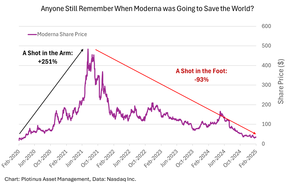
Thankfully the stock market is quite good at correcting its excesses, something which we noted in our 2020 white paper Artificial Intelligence: The Post-Pandemic US Equity Strategic Allocation in relation to how rapidly the S&P 500 corrected its own initial coronavirus panic.
Emotive Benchmarking and Endless Spin
Trying to be statistical and data driven may be the right approach, but it is actually much harder to do than one might think. When the issues beneath the data are emotive, this unfortunately tends to permeate the data itself. Thus it becomes very difficult to extricate clean untarnished, unbiased data. The coronavirus situation is a good example, firstly there was an overwhelming amount data (leading to much misunderstanding), but secondly, that data was awash with every emotion and agenda of the day. This caused problems for any attempt at unbiased data analysis.
Let us look for a moment at the effects of spin on data (the agendas that lie behind its composition and analysis). The UK’s Office of National Statistics for its annual report for Deaths Registered in England and Wales 2023 will act as an example. There are clearly two different messages that can be constructed from the following charts from the report. Look at how Figure 2 was headlined and look at the two dotted lines equating the “Spanish Flu” and the “COVID-19 pandemic.”
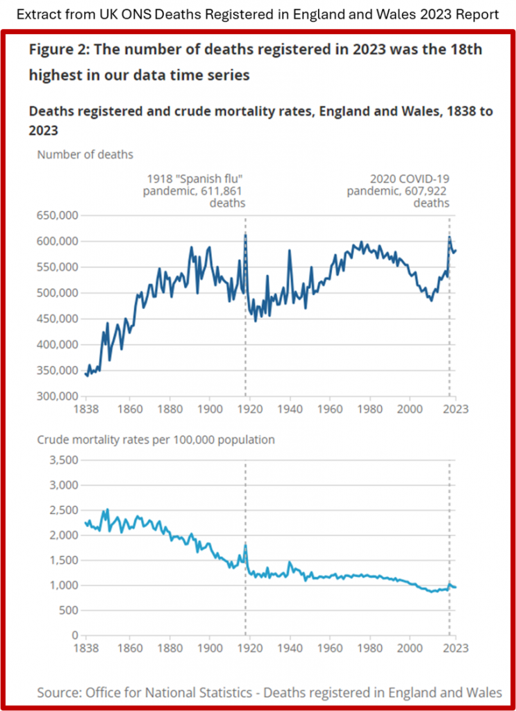
The headline evokes a response of concern like; this is very serious 18th highest, Chart 1 shows how awful 2020 was, it was like 1918! and 2023 (the year of the report) is still frighteningly high.
The data however, could just as easily have been presented with Chart 2 first and a heading like, “Figure 2: The number of deaths registered per 100,000 population in 2023 was the 15th lowest in our data time series.”
To labor the point somewhat further, just to illustrate how much spin can be put on data, imagine if Chart 2 was presented as follows (same data, same chart just a different orientation of the dotted grey lines):

The data presented in this manner certainly would not elicit a feeling of concern though it could draw responses from either end of the spectrum, for example:
A: Look at how negligent previous governments have been, there should have been a permanent lockdown and cessation of normal economic conditions from 1838 to 2000 given how deadly those years were, they were as bad or worse than 2020.
Or
B: Why the lockdowns and suspension of normal economic conditions in 2020 considering that every recorded year pre 2000 was equally as deadly or worse than 2020 and we didn’t have lockdowns then?
The above illustrates how flexible the interpretation of data is and just how influenced it can be by emotion, particularly fear, something that, as we have already alluded to, surrounds the topic of health.
Can the Same Investor Critical Thinking that is Applied to Other Sectors be Applied to Health Care?
Moving to a connected but somewhat different track, part of the dynamics of capitalism, is the improvement of product quality and gradual reduction in production cost over time. Put simply things tend to get better and cheaper through continuous improvements in production. Take the development of computers as a case in point. From 1970 to 2020, the number of transistors on microchips has followed Moore’s Law (roughly doubling every two years) this accounts for an increase from approximately 2000 transistors in 1970 to 50 billion by 2020. In effect this is a measure of improvement in processing power.
Over that same period, the price per unit of computer memory (RAM) has experienced an inverse decay. In 1970 one terabyte of memory cost $4.89 Trillion by 2023 one Terabyte of RAM cost $1,088. A clear example of things getting both better and cheaper to produce.
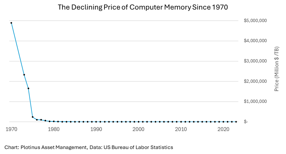
Technology as an industry sector though does not serve as a helpful comparison for health care. Unfortunately, there is not a Moore’s Law for health.
For our comparison It would better to take something with somewhat similar criteria. Something, that can get ill, needs to be constantly maintained, gets old and ultimately stops working and dies—the automobile.
The next chart shows US personal consumption with regards to health care and automobiles expressed as a percentage of total personal consumption expenditure. This gives us a context to view the relative expenditure on the two sectors.
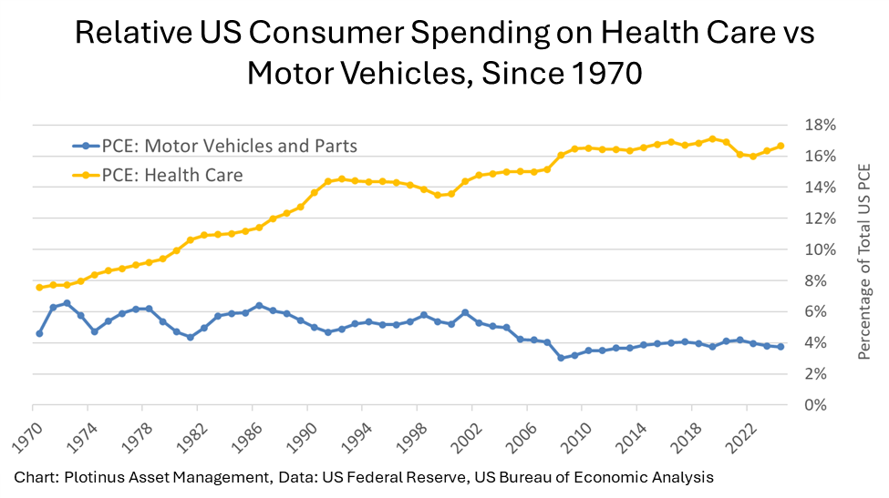
The percentage of expenditure on health care has more than doubled since 1970, standing at 16.6% of PCE, in other words each American is spending $16.60 of every $100 on health care. Automobiles show a different story, within some ups and downs this spending has remained in and around 4% since 1970, it was 3.7% in 2024.
Dare We Ask Is Health Care Worth it?
So how might one attempt to answer this question. The emotions automatically answer that question with a resounding “yes”. But what we are looking to do here is to attempt to take a step back and try and answer that question empirically.
Health care is a complex field with many ways of assessing its impact and development over the past half century. The best measure, perhaps, of its overall impact is reflected by the broadest measure of health—longevity. Quite simply, the healthier a broad population is, the longer it will live. Interestingly also, longevity of sorts can be used to illustrate the same for automobiles expressed as the average age of cars in the US.
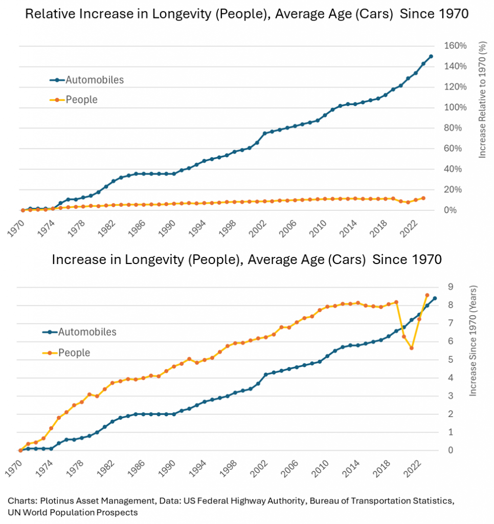
You will note that from this chart that there is a comparison dilemma, a raw figure (years) and a relative figure (%). The life expectancy of a person and the average age of a car have increased by eight years since 1970. However, a car now lasts more than twice as long as it did in 1970, people on the other hand live 12% longer.
It is important to breathe deeply and calm the heart palpitations of the emotions, at the audacity of comparing human years lived to those of a car on its way to the scrap heap and recall that we are looking to try to answer a question of value for money.
$3.70 for every $100 buys you a car that is now lasting 14 years instead of 5.6. Quality has improved but the effective cost has not changed very much, in fact it has decreased over the years. This is what one would expect from a functioning sector of the economy. What the health care figures illustrate though is that they are not functioning in the mode of a normal economic sector, yet that sector is monstrously economically significant, consuming $16.60 of every $100. Observing the increase in life expectancy over those 50 years and assuming that to equate with improved quality of health care. Why has health care spending increased by 218% while automobile spending decreased by 20% when it too can clearly illustrate (a much more significant) improvement in quality?
From an expenditure perspective, health care’s performance does not justify its expense. The health care sector, regardless of how important it currently is, is not justifiable from an accounting perspective, instead, it is functioning on belief. The belief that it is essential and vital (in the literal sense of the word) and making us better and there is a certain sanctity surrounding this belief. This is the only explanation for health care’s oversized share of every American’s wallet. Beliefs can of course last forever. However, if they are shown to collapse under the weight of fact, particularly in the markets, those beliefs can evaporate very rapidly.
We will end with a final disquieting thought on longevity, the premise we have used to illustrate people’s increased healthiness and theoretically, by extension a proxy for measuring the benefits of health care. There is considerable medical literature examining the effect of health care on longevity for example, Contributions of Health Care to Longevity 1, which estimates that only 10% of increased longevity for Americans can be attributed to medical care.
So, imagine dividing all of the “benefits” illustrated in the previous charts by 10. This means that of the eight years of extra longevity since 1970 only 0.8 years are as a result of health care (the remaining 7.2 years are due to societal changes and other factors). In that context and emotions aside, does that $16.60/$100 of expenditure really seem worth it? The savvy investor should keep this in mind when making long-term assessments for how to cleverly invest in health care. ■
1 Kaplan RM, Milstein A, Contributions of Health Care to Longevity: A Review of 4 Estimation Methods, Ann Fam Med. 2019 May;17(3):267–272. doi: 10.1370/afm.2362/
© 2025 Plotinus Asset Management. All rights reserved.
Unauthorized use and/or duplication of any material on this site without written permission is prohibited.
Image Credit: PeopleImages-YuriA at Shutterstock.